

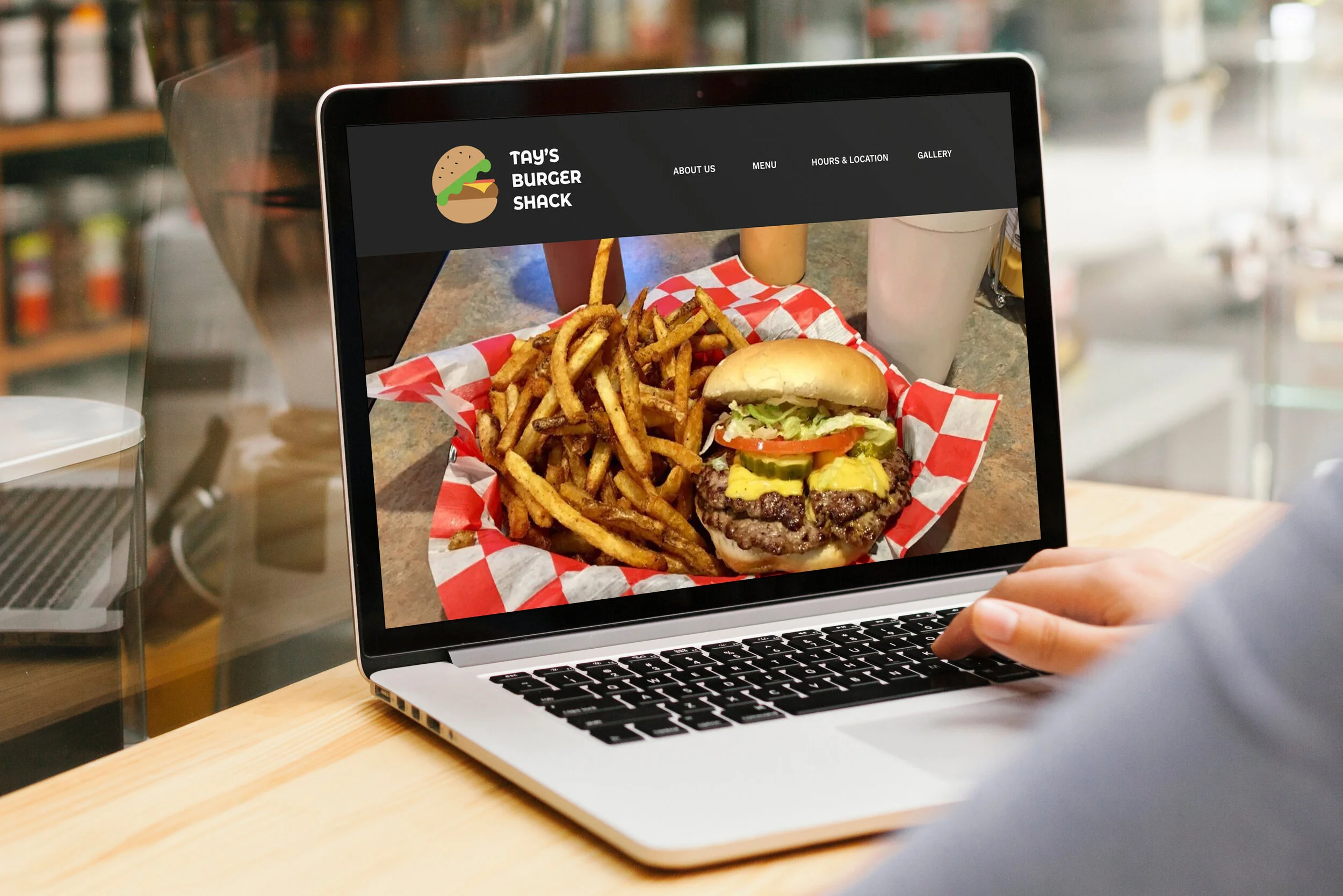
Tay’s Burger Shack
Designing a responsive website for a local small business
Project Overview
Challenge: Tay’s Burger Shack is a local burger restaurant that was established in 2014. Quickly gaining a reputation for being one of the best burger restaurants in the area, they expanded to two locations, one in North Kansas City and the other in Overland Park, KS. They are known for a simple and classic burger menu, hand-cut fries, and specialty sauce. Tay’s Burger Shack currently doesn’t have a website, and its only online presence includes a Yelp page, a Facebook page, and an Instagram account.
Solution: Design a responsive website for customers to 1) learn about the menu, location, and hours of operation, 2) see pictures and 3) read stories about the restaurant.
*This is a speculative project and Tay’s Burger Shack is a real local restaurant.
Role
UX Designer UX Researcher (Individual project)
Tool
Figma Adobe Photoshop
Duration
2 weeks

Research
Process: Secondary research, Provisional persona, Primary research, Empathy Map, Persona
Research Goals
The key goals of the research were to…
1) define the target audience
2) gain insights on their online and in-person burger experience
3) identify factors of positive and negative online experience
4) identify what information customers would need or look for on a website
5) Discover opportunities to differentiate the restaurant.
View the full research plan here. View the full research plan here.
Market Research
I focused my research on the burger industry to discover any market trends that the restaurant might follow, target demographic to expand their existing clientele, and common consumer behaviors. This gave me valuable insights to target the right consumer segment and understand their needs when designing a website.

Competitive Analysis
In order to evaluate where Tay’s Burger Shack stands, I identified both direct and indirect competitors and defined their strengths and weaknesses. Some of the strengths were unique brand identity and media presence and some of the weaknesses were inconsistent UI design and lack of locality. This research showed me how Tay’s Burger Shack could best position itself to be a strong contender within its local market.

Provisional Persona
I developed four provisional personas based on my market research to help me define target users when conducting user interviews. Their goals and pains will be validated or invalidated during the user interview.

Interviews
I conducted in-person and remote user interviews to gain qualitative data of user needs, wants, and pain points. I asked them open-ended questions about general burger experience as well as specific questions regarding their experience at Tay’s Burger Shack.
Participants: 8 Tay’s Burger Shack customers (6 males + 2 females)
Average interview duration: 11 minutes
Ages: 24 - 50
All residing in Kansas or Kansas City area
Empathy Map
To synthesize my findings from my interviews, I transcribed all my interview data and gathered information by creating an empathy map. I discovered six common patterns which lead to insights and user needs.
Categories: Doing, Thinking + Feeling, Saying, Hearing, Pains, Gains
Patterns Found: Service, Information on website, Research, Recommendation, Reviews, Pictures
Insights discovered…
Customers look for information like menu, location, price and hours.
Customers do their research on burger restaurants using online resources.
Customers take recommendations from their friends, family, or coworkers.
Customer read reviews before visiting a restaurant.
Customers look at pictures to check the menu items.
Needs defined…
Customers need to be able to find information online.
Customers need to know what other people are saying about the restaurant.
Customers need to see pictures of the restaurant and the food offered.
Persona - Meet James!
Based on the research and the insights from the empathy map, I created a persona that best represents our main consumer segment. James is a millennial male who is deeply interested in supporting local businesses. He often resorts to Yelp or Instagram to discover new restaurants and read reviews. James will be the reference I will come back to time and time again to empathize with users during the design process.


Define
Process: POV Statement + HMW Questions, Brainstorming, Business + User Goals, Feature Roadmap, Sitemap, Task Flow, User Flow
POV Statement + HMW Questions
After identifying my persona, I created POV statements and HMW questions to frame the problems from James' point of view I was going to solve. I then translated these POV statements into HMW questions to begin brainstorming solutions.

Brainstorming
Answering to the HMW questions, I brainstormed ideas using a mind map. This helped me to think of many ways to approach each problem by connecting and expanding ideas. I focused on generating as many solutions as possible in a limited time frame.

Business + User Goals
Acknowledging that a successful website will benefit both the business and the users, I defined the business and user goals by outlining them in a Venn Diagram to identify common goals. These goals guided my design decisions in the following process.

Feature Roadmap
After setting the project goals, I created a feature roadmap to define key features that should be included in the product’s design. I ranked the elements by priority based on the research, persona, and the project goals.
View the feature roadmap here.
Sitemap
Referring to the feature roadmap, I created a sitemap to structure the user navigation and made sure the their experience was as seamless and easy as possible.

UI Requirements
Delving deeper into each page, I created a list of features or techniques that enable each page on the website to serve its purpose. This will help during the design process not to neglect any important details.
View UI requirement here.
Task Flow & User Flow
In order to demonstrate how James would interact with the website, I created three different tasks based on his needs to help define how he would find menu, access reviews, and see pictures on the website. The linear task flow helped me to be in James’ shoes to ensure his interaction was easy and straightforward. Then I created user flows to simulate how users navigate on the website in three different scenarios. The user flow allowed me to explore the website in more realistic manner with multiple decision trees and exit points.

Task Flows showing all pages and actions needed to complete three tasks.

Ideate
Process: Low-Fidelity Wireframes, Mid-Fidelity Wireframes, Responsive Wireframes
Low-Fidelity Wireframe Sketches
Referring to my sitemap and flows, UI Requirements, and competitor websites, I sketched out the wireframes each page on the website. These low-fidelity wireframe sketches allowed me to quickly lay down my ideas and to assess whether the elements are easy to navigate.

Mid-Fidelity Wireframes
I digitized my mid-fidelity wireframes to help me evaluate the visual hierarchy, structure and the flow of the design before adding the visual elements and content.

Responsive Wireframes
To ensure the optimal user experience, I created responsive wireframes for desktop, tablet, and mobile screens so that users can access the website via multiple devices.
One of the challenges I faced during this process was to scale elements properly throughout the different screen sizes. In order to combat this challenge, I employed the “mobile first” approach to design elements on mobile first and applying on the bigger screens.

Responsive wireframes for the homepage

Prototype
Process: Mid-Fidelity Prototype
Mid-Fidelity Prototype
I created mid-fidelity prototype using Figma and prepared for usability testings. Mid-fidelity prototype allows users to evaluate the visual hierarchy, IA, and design flow without being distracted by visual elements like colors and images.

Test
Process: Usability Testing, Affinity Map
Usability Testing
Before conducting the usability testings, I created a usability testing plan to outline the scope of the test. The goal of the usability test was to uncover any pain points or usability issues with the website.
Participants: 3 (1 male + 2 females)
Average Interview Duration: 11 minutes
Age: 26 - 30
For this project, I used a mid-fidelity prototype. The lower level of details allows users to focus on fundamental usability issues rather than being distracted by colors or fonts. I conducted both in-person and remote testings and they were all moderated. I gave a brief introduction about Tay’s Burger Shack to the participants and asked them to walk me through their interaction out loud. I gave them three different scenarios and tasks to complete and recorded their interaction, comments, and feedback.
View full usability test findings here.
Affinity Map
After the testing, I gathered and synthesized all test findings, using an affinity map. Then, I synthesized all the insights in order to find the the most prominent patterns in user comments, actions, and pain points that led to solutions for improvements.
Insights
Participants valued pictures a lot, especially in “About Us“ and ”Menu” pages.
Participants commented that highlighting the local partnership will enhance the brand image and will differentiate the brand.
2/3 participants wanted to see more visual aids on menu page.
Pain Points
2/3 participants said the menu page needed visual aids to eliminate ambiguity and confusion. Some of the suggestions included adding a * next to combo meals and showing drink options.
2/3 participants said the menu layout was unconventional and slightly confusing.
Recommendations
Add more pictures of local partners on “About Us” page to enhance the brand image and increase the user engagement.
Include visual aids on the menu as well as reconfigure the layout to eliminate any confusion.
Based on the feedback and the recommendations, I improved my mid-fidelity wireframes and made priority revisions to include more pictures, add visual aids on the menu and reconfigure the menu page altogether.


Design
Process: Branding, Style Tile, High-Fidelity Wireframes + Prototype
Branding
To set a clear visual direction for Tay’s Burger Shack, I created a mood board to help guide my design decisions that aligned with the brand attributes - inviting, casual, lively, exciting, fun. I used a Pinterest mood board to help me collect visual elements, including colors, typography, layout, and images.
View mood board here.
Style Tile
Referring to my mood board, I created a style tile that houses all the visual elements such as logo, color palette, typography, and images. This helps to create a cohesive and consistent UI application.

High-Fidelity Wireframe + Prototype
Bringing life to the bare bones, I added all visual elements to the mid-fidelity wireframes to create high-fidelity mockups of Tay’s Burger Shack’s pages and created a prototype using Figma.

Closing Remarks
Lesson learned
Shortly after I began the project, I realized that customers are very picky and difficult to please. That’s also when I learned the importance of careful listening. People feel appreciated when they are listened to, and that was my goal as a designer in this project. I wrestled to understand users’ needs and pains and tried to translate that via my design.
If I could do this again…
If I was given more resources, I would conduct more usability testings. Given the limited time and situational restrictions, I was able to complete usability testings with only three participants. As a result, some of the insights were left untested and were not reflected in the final design.
Next Step
I want to further develop the final prototype to expand some of the features. For example, I want to test linking multiple social media accounts to the website and test whether it further increases the user engagement. Additionally, I want to test whether the hi-fi prototype uncovers any other errors or pain points.