

MIRROR
Creating a responsive website for a clothing eCommerce
Project Overview
MIRROR is a global clothing chain that offers affordable clothes for every occasion. Already a successful business with over 400 stores around the world in 32 countries, MIRROR has been exclusively operating offline. However, they face increasing demand from the customers to offer online shopping service and they see an opportunity that online stores can help them manage inventory more efficiently.
The goal of the project is to design a responsive website with efficient filtering systems for easy browsing and purchasing experience and re-brand its outdated logo.
MIRROR is a fictitious brand and the project contents are made for educational purpose.
Role
UX Designer UX Researcher (Individual project)
Tool
Figma Adobe Illustrator Adobe Photoshop
Duration
6 weeks

Empathize
The goal of this phase is to look into users’ situations, share their emotions and understand their mindset in order to identify the users’ needs.
Research Goals
Before conducting the research, I outlined some research goals to guide my research. The key goals were to 1) define the target audience, 2) determine their consumer behaviors, 3) identify what makes a frustrating or pleasurable shopping experience, and 4) discover opportunities to differentiate and optimize the user experience. View the full research plan here.
Market Research
The first step was to conduct a market research to gain insights in the clothing industry, target demographic, and their behaviors. Followings are some of the key discoveries.
Market
The online domain attracts more than 1.92 billion shoppers annually.
Online purchase accounts for 14.1% of all retail purchases worldwide.
Clothing is the leading category of online purchase, which consists of 59% of all sales.
Demographic
67% of Millennial prefer shopping online than in-store.
95% of Gen Z have smartphones, and they are heavily influenced by social media.
Men spend 68% more than women.
The target audience is Millennial as more than 60% of the demographic shop online.
Behaviors
The research also suggested that more than 63% of all shopping begins online, and even the offline shoppers tend to check online resources for better price comparison.
65% of people check online for price comparison while shopping in-stores.
67% of users window shop for fun on their mobile devices, and 77% of them make impulse purchases.
More than 88% of the consumers think detailed product pages are crucial in decision making for purchases.
Competitive Analysis
I analyzed five companies from both direct and indirect competitors in order to find strengths we can emulate and weaknesses we should avoid. Some of the strengths of the direct competitors were strong online presence and modern UI whereas the most prevalent weaknesses were inconsistent UI design and limited filtering system. It was more difficult to find common trends in the indirect competitors as their business models varied.

Interviews
I conducted user interviews with 4 participants aged between 25-51 to gain qualitative data of user needs, wants, and pain points. I asked them open-ended questions about their shopping behaviors and previous shopping experiences in order to understand their needs and frustrations.
Empathy Map
From the user interview, I created an empathy map to gain deeper understanding of users while summarizing the research findings to find user needs and insights.
Insights
Users are motivated to shop when they see a sale.
People want convenient shopping experience.
Product quality is an important factor of decision making process.
Online shoppers tend to struggle with product sizing.
Consumers prefer brands that they already know about.
Needs
Users need to know they are getting the best deal.
They need to shop efficiently.
They need to be confident about the product quality.
They need to know accurate sizing.

Persona
Based on the research and the insights from the empathy map, I created a persona that best represents our main consumer segment. I will be using the persona as the main reference in the following process, and all design decisions are to meet her needs and to resolve her frustrations.

Define
During this phase, I use all the gathered data from research phase to define the project’s goals and lay down the blueprint for the ideation phase.
Project Goals
After the research findings were synthesized, I moved on to define the project goals. I combined business goals from the MIRROR’s business brief, user goals defined by the research, and high-level technical goals to ensure that the design prioritizes features that will impact both the business and users positively.

Feature Roadmap
After setting the project goals, I created a feature roadmap to define key features that should be included in the product’s design. I ranked the elements by priority based on the research, persona, and the market standards and ROI or Return on Investment.

Card Sorting
After defining what features should be included, I moved on to see how users respond to the contents. I asked 6 participants to do an open card sorting exercise to see how they naturally organize contents. This eliminates any biased assumptions and ensures that designers can provide a successful information architecture. View the full card sorting exercise report.
UI Requirements
In order to ensure that the site’s features match what the user needs to complete their tasks, I outlined the UI requirements. I put myself in user’s shoes and imagined the task process to define some high-level features as well as specific requirements for each page.
Sitemap
Next, I created a sitemap to organize the contents by pages and features. It was essential to create the sitemap structure before adding any design details to ensure that the website functions as intended for the optimal user experience.

User Flow
Then I created a user flow to demonstrate how users might navigate on the website in three different scenarios. This process allowed me to explore the website in user’s shoes and simulate their interactions with the design.

Ideate
With the insights and the patterns observed from the first two phases, I started generating ideas for the design that would meet the needs of the business and the users.
Homepage Sketches
After defining the goals and the features needed for the final design, I started iterating for the MIRROR’s homepage. The layout and each element were placed to meet users’ needs and resolve frustrations.

Mid-Fidelity Wireframes
After assessing each homepage iteration and choosing the best IA structure, I digitized the sketch and created mid-fidelity wireframes of the homepage, product listing page, and product detail page. This allowed me to further assess the visual hierarchy, balance, and overall details of the designs.

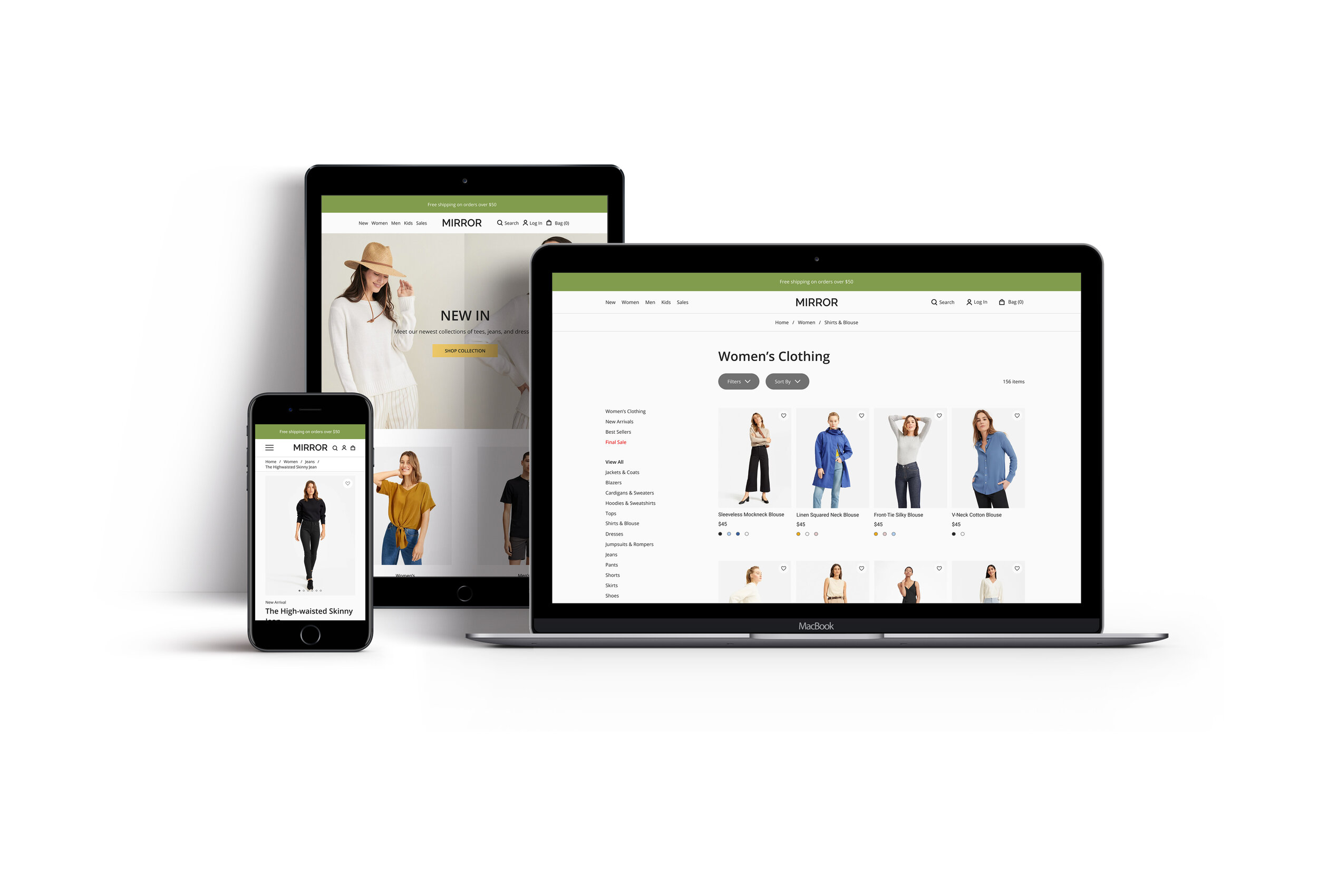
Responsive Wireframes
To ensure the optimal user experience, I created responsive wireframes for desktop, tablet, and mobile screens so that users can access the website via multiple devices.
One of the challenges I faced during this process was to scale elements properly throughout the different screen sizes. In order to combat this challenge, I employed the “mobile first” approach to design elements on mobile first and applying on the bigger screens.

Responsive design for the homepage

Responsive design for the product detail page
Branding & UI Kit
Once the structure was built, I moved forward with the visual design. I listed out MIRROR’s brand attributes - Simple, Fresh, Balanced, Modern, Neutral, and Comfortable - and created logo, color palette, and typography accordingly. Then I created a UI Kit that houses all the visual elements to ensure consistency throughout the website.

Prototype
During this phase, I built testable prototypes with all the visual elements and features in order to assess the design decisions, hierarchy, and discover any errors or mistakes before the hand-off.
High-Fidelity Prototype
With the high-fidelity wireframes complete, I created a testable prototype for usability testing.

Test
During the test phase, I tested usability of the high-fidelity prototype to identify any points to improve on before launching the digital product.
Usability Testing
The goal of the usability testing was to uncover any unforeseen errors or confusion in the design and to revise the design before handing it off to the developers. I created a usability testing plan and recruited eight participants to conduct moderated, remote usability testings. Each participant was given four scenarios and asked to complete tasks. I asked each participant to walk me through their process (they were asked to think aloud) to identify patterns and pain points worth noting. View the usability testing summary.
Affinity Map
After the testing, I created an affinity map that displays all the test findings. Then, I synthesized all the insights in order to find the the most prominent patterns in user comments, actions, and pain points that led to solutions for improvements.

Priority Revision
Based on the usability test findings according to the affinity map, I discovered a few points to improve on. I listed out some of the most prominent and common usability test insights and corresponding revisions for seamless user experience.
All participants commented on the checkout process being easy and intuitive. Most participants also mentioned that the overall design is clean and aesthetically pleasing. I decided to keep the design structure and flow for the final version.
50% of the participants had issues with the current filtering system. I recommended to highlight the filtering system for users to easily locate them and included necessary filtering categories for convenient browsing.
Four participants missed shipping option selection. This led to a conclusion that I should make the shipping option box more visible by adding colors or shapes around it.
The majority of the participants mentioned that they want as easy checkout process. Some prefer to proceed without creating an account. Thus, I added a “continue with social media account“ on top of the “continue as a guest“ feature that the website already has in order to make the checkout process as easy and convenient as possible.

Reflection
The importance of face-to-face engagement
Due to the current situation, all user interviews and usability testing were conducted remotely. However, I realized how important it is to engage with the participants during the user interviews and usability testing because it could better connect the designers with the users which is ultimately what we strive for. The rapport leads to commentary and the user engagement leads to invaluable insights. If I could redo this project, I would definitely conduct some of the interviews and testings in-person.
Don’t forget “the person”
As a novice designer, I was prone to forget about “the person“ during the later phases of the design process. Only after my mentor reminded me of the persona, I realized how important it is to remember exactly who I am designing for in order to create a cohesive and effective final design.
Silence my voice, listen to theirs
Throughout the design process, I had to face a harsh yet crucial reality that designers should silence their own voices to accurately listen to the users’ needs. When I eliminated all my assumptions, I was able to discover valuable insights and true empathy.
Next Steps
I would further develop the prototypes in order to simulate more realistic and functional design for another round of usability testing. I want to see if there are more improvements to be made.
I would also further develop the design by incorporating features based on the feature roadmap and see if additional features can significantly improve usability of the design.