


BOOKSTORY
End to end mobile app design that allows people to discover and track books
Overview
Many Americans spend less than 10 minutes each day reading, and their primary reason is the lack of time.
The key purpose of Bookstory was to make the reading experience easier, faster, and more organized for the users. Inspired by goodreads.com, Bookstory wants to give a more user-centric approach to the app, adding features and flows that make it delightful for people to use.
Bookstory uses the full potential that a mobile app has, such as utilizing the camera to register books in a more automated way, suggesting book recommendations that are tailored to each user, and helping the users to add and track their book collections.
Role
UX/UI Designer UX Researcher (Individual Project)
Tool
Figma Google Form Sketching tools (iPad, iPencil)
Duration
80 hours / 2 weeks

Research
Process: Market research, Competitive Analysis, Survey, User Interview, Empathy Map, User Persona
Research Goals
In order to set the scope of the project, I wanted to first gain insights from avid book readers to discover ways to improve user’s current reading experience easier, faster and more enjoyable. So, I outlined some goals to guide my research.
Define the target audience.
Understand the print/e-book/audiobook industry.
Identify the strengths and weaknesses of the competitor apps.
Identify how people currently discover books.
Identify how people keep track of books they have read, are reading, and want to read.
Identify users’ goals, needs, motivations, and frustrations in their reading experiences.
Market Research
First, I conducted market research to discover trends in the book industry, identify our target demographic, and common user behaviors.

Competitive Analysis
Alongside the market research, I wanted to understand who Bookstory is competing with. I identified both direct and indirect competitors and analysed their strengths we can emulate and weaknesses we should avoid.

Surveys
After gaining insights through market research and competitive analysis, I started digging deeper into user behaviors through surveys. The goal was to understand the current reading habits and their existing pain points.
92% of the respondents prefer physical books instead of e-book or audiobooks despite the possible inconvenience.
Then 67% of the respondents said they read books for fun or to experience a different world.
More than 83% of the respondents discover books through recommendations from friends and family, and 58% of the respondents through bookstore displays.
92% of the respondents will decide to read a book if they get recommendations from friends and family or 83% if they get words from the author they like. 75% of the respondents will read a book if they like the genre.
Most respondents learn about a book before buying it. 67% will read the back of the book for summary, 42% read reviews, and 42% read the first chapter.
User Interviews
Now, it was time to gain qualitative data through user interviews. Before jumping into the interview, I created a interview guide. Then I recruited participants using Slack and conducted remote user interviews to gain insights about their current reading habits and pain points.
Participants: 3 book readers
Ages: 26-29
Average interview duration: 29 minute
Empathy Map
After synthesizing all the interview findings, I was able to extract five common patterns which lead to some insights and user needs I can use to start brainstorming.
Insights discovered
People keep track of their books using a list.
People rely on recommendations to find books to read.
People discover books by diverse categories like the genre.
People like to share their book experiences with others.
Needs defined
Users need an easy way to organize their books.
Users need book recommendations from diverse sources.
People need an easy way to filter their book search.
People need a platform to learn about others’ book experiences.

Meet our persona, Sophia!
Sophia is a millennial female who reads books to explore a new world. She likes to discover new books that fit her taste and wants an easy way to organize her ever-growing book lists.


Define
Process: POV + HMW, Brainstorming, Business + User Goals, Sitemap, User Flow
POV + HMW
After identifying my persona, I created POV statements and HMW questions to frame the problems from Sophia’s point of view. I then translated these POV statements into HMW questions to begin brainstorming for actionable ideas and solutions.

Brainstorming
Answering to the HMW questions, I brainstormed ideas using a mind map. This helped me to think of as many ways to approach each problem by connecting and expanding ideas. I focused on generating as many solutions as possible in a limited time frame.

Business + User Goals
Acknowledging that a successful design product will benefit both the business and users, I defined the business and user goals by outlining them in a Venn Diagram to identify mutual goals. These goals guided my design decisions in the following process.

Sitemap
Keeping the mutual goals in mind, I built a sitemap to place screens and features of Bookstory app and evaluate their flow and visual hierarchy.

User Flow
In order to imagine how Sophia would interact with the app, I simulated her navigation, using user flow chart. User flow gave insights of how Sophia would navigate on the app through multiple decision points seamlessly.


Ideate
Process: Low-Fidelity Wireframe Sketches, Mid-Fidelity Wireframes
Low-Fidelity Wireframe Sketches
Referring to user goals and the flow chart, I began sketching the low-fidelity wireframes. These low-fidelity wireframe sketches allowed me to quickly lay down my ideas and assess whether the elements are easy to navigate.

Mid-Fidelity Wireframes
Then, I used the iOS design pattern as well as competitive analysis to apply legible and clear designs.


Prototype
Process: Mid-Fidelity Prototype
Mid-Fidelity Prototype
Based on the wireframes, I created a mid-fidelity prototype to conduct usability testings. I wanted to see users’ interactions and discover any frustrations or opportunities to improve the design. I decided to conduct the usability testing with mid-fidelity wireframes to help users focus on the navigation rather than being distracted by visual elements like colors and images.

Test
Process: Usability Testing, Affinity Map, Priority Revisions
Usability Testing
Before conducting the usability testings, I created a usability testing plan to outline the scope of the test. The goal of the usability test was to uncover any pain points or usability issues with the design. Then I recruited test participants for the moderated remote testing. Each participant was given four scenarios and tasks to complete, and the process was recorded for observation.
Participants
Participants: 5 (1 male + 4 females)
Average Interview Duration: 14 minutes
Age: 24-29
Tasks
Search for a book title and add it to a reading list.
Discover highly-rated new mystery books.
Scan a book and add it to a reading list.
Find a saved book and learn what other readers think about the book.
Affinity Map
After the testing, I gathered and synthesized all test findings, using an affinity map. Then, I synthesized the insights in order to find the the most common patterns or frustrations in user comments, actions, and pain points that led to recommendations for improvements.
Patterns
All participants relied on subcategories to discover new books and all experienced frustrations regarding the wording of the subcategories. Some participants said the wording was too broad and others mentioned that there should be clearer distinguish between each subcategory.
All participants had no issues finding and recognizing what the icons indicate.
3 out of 5 participants couldn’t distinguish the difference between "Home” screen and “Discover“ screen.
3 out of 5 participants asked about content in the “More“ screen.
Recommendations
Refine names of the subcategories for clearer navigation.
Utilize icons that indicate features very clearly.
Revise the navigation bar and let users know what each menu provides.

Priority Revision
Based on the insights from the affinity map, I revised the mid-fidelity wireframe and prototype to minimize user confusion and optimize their experience on the app.


Design
Process: Logo, UI Kit, High-Fidelity Wireframes + Prototype
Logo
To give the design a face, I first sketched different iterations of the logo to see which best represented Bookstory’s brand identify. Then, I selected a few logos that conveyed our app’s goals the best and digitized them to test scalability and legibility. After some evaluations, I chose the logo (2-2) because it best represented the brand identity - Inviting, Trustworthy, Fresh, Modern, and Simple.

UI Kit
After creating the logo, I decided on the typography, color, and app design based on the attributes and created a style tile and UI Kit. They will ensure that the visual elements are consistently applied throughout the app. The UI Kit is a living document, meaning it will be updated as the Bookstory’s app evolves.

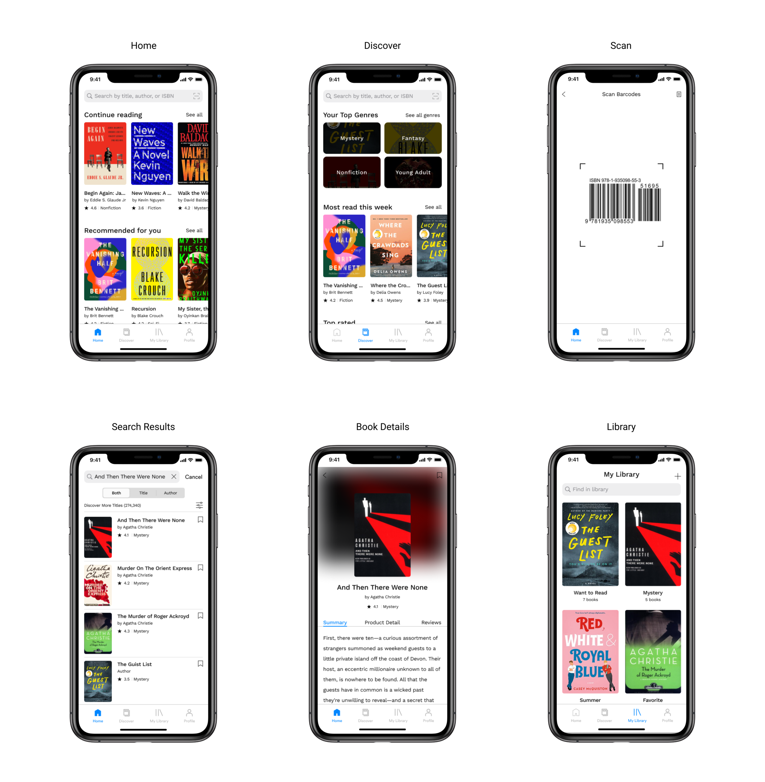
High-Fidelity Prototype
After the priority revisions, I updated my previous wireframes and create a final version of high-fidelity prototype.
Closing Remarks
The “real“ connection
During the end-to-end project, I felt how important it is to listen to users’ needs and create a product that tackles more foundational issues. I strongly felt that in order to dig deeper into users’ motivations and frustrations, I needed a real connection. Due to COVID-19, all of my user interviews and usability testings were conducted remotely. And I think the project could’ve benefited more if the user-involved interactions were done in face-to-face environment for better connection and rapport.
The second round of testing
If I was given more time and resources, I would conduct a second round of usability testing with the high-fidelity prototype to see if the revisions helped to solve the frustrations users had. Did the changed wordings ease their confusion? Is the home screen different enough from the discover screen?
Do we need another social media?
During the competitive analysis, I realized that many reading/book tracking apps started implementing “social media” features such as feeds, following friends, and sharing pictures or quotes. I want to see if more social capabilities would increase users’ engagement on the app or will distract them from reading.